What Is Responsive web design ?
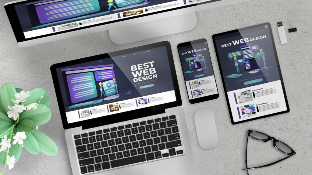
Responsive web design (RWD) is an approach in web development that focuses on creating sites that respond seamlessly to any device, from desktops and laptops to tablets and smartphones. RWD goes beyond simply “shrinking down” websites for smaller screens; rather, its goal is optimizing layout, content, and functionality to deliver an optimal experience regardless of the visitor’s device type.
RWD Meaning In Resposnive Landscape ?
In the world of Responsive web design you hear the term (RWD) and you get confused !!
RWD Stands for Responsive Website Design
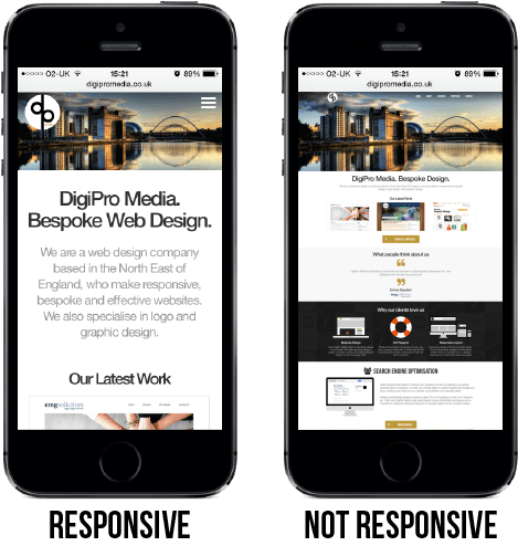
Responsive Vs non-responsive website example
Why is responsive web design important?
With screens coming in all shapes and sizes, having a website that looks good and functions seamlessly on each of them has become an absolute necessity in today’s digital landscape. That is where responsive web design (RWD) steps in as its magical solution: making your website adaptable across platforms without disrupting its message or user experience. But why exactly does RWD matter so much? Here are a few reasons why you should start applying responsive design to your website
Enhanced User Experience:
The purpose of responsive design is to make websites look and work great on all kinds of devices. It Eliminates Zooming and scrolling on smaller viewports.
It enhances the user experience and increases the likelihood that visitors will engage with your content, remain interested, and possibly become loyal customer.
Increase in Mobile Traffic
Given that mobile devices account for 60% of all website traffic in America, it is evident why your website needs to be responsive and mobile-friendly. To increase your website Traffic.
Enhanced SEO
A responsive website is likely to increase a brand’s search engine rating, which in turn attracts more organic visitors to the website. Search engines favor mobile-friendly websites in their search results.
The main pillars of RWD
Fluid Grid Layouts
Think of your website as a flexible grid rather than a fixed box. This kind of grid allows elements to resize and rearrange themselves according to the available space, be it a tiny smartphone screen or a sprawling desktop monitor, because it uses relative units like percentages and viewport widths instead of fixed pixels
Media Query
A media query is a CSS technique used in responsive web design to adjust a website’s layout and style depending on the size of the screen or device it’s being viewed on. Media queries use CSS rules to target specific screen sizes or device types and apply custom styling to optimize the website’s appearance and user experience. This allows a website to appear properly on screens of all sizes, from desktop computers to smartphones and tablets, and ensures that users can easily navigate and interact with the content regardless of the device they’re using.
RWD Frameworks
Building a responsive website from scratch can be daunting. Thankfully, a whole arsenal of RWD frameworks exists to empower you! These frameworks provide a pre-built structure, libraries of components, and helpful tools to streamline your development process and ensure a seamless user experience across devices.
Bootstrap
Bootstrap is a free and open-source CSS framework directed at responsive, mobile-first front-end web development. It contains HTML, CSS and JavaScript-based design templates for typography, forms, buttons, navigation, and other interface components.
Tailwind CSS:
Tailwind CSS is an open-source CSS framework. The main feature of this library is that, unlike other CSS frameworks like Bootstrap, it does not provide a series of predefined classes for elements such as buttons or tables.
Conclusion
In conclusion, responsive web design (RWD) has become crucial for modern websites due to the ever-increasing usage of mobile devices. RWD allows websites to adapt to screens of different sizes while maintaining their design and functionality. This approach ensures an optimal user experience for all visitors, no matter which device they use. Implementing responsive design techniques can help web developers to reduce development and maintenance costs by avoiding the need to create multiple versions of a website for different devices. Furthermore, RWD provides significant SEO benefits and can improve website loading times, which is crucial in today’s fast-paced digital environment. As mobile usage continues to grow, responsive web design will only become more important. Therefore, it is essential to prioritize RWD, so websites can provide users with an efficient and enjoyable browsing experience.